The 'I'm Stuck' Moment: Building Learner Support Where They Quit
Learners quit when they hit roadblocks without good learner support. Learn practical ways to design in-course help that reduces friction and keeps them moving.
So, your course is live. Learners start strong. Then they hit a wall. They feel lost, frustrated, and click away.
All gone.
This happens every day. Busy professionals juggle jobs and training. One snag, and they forget.
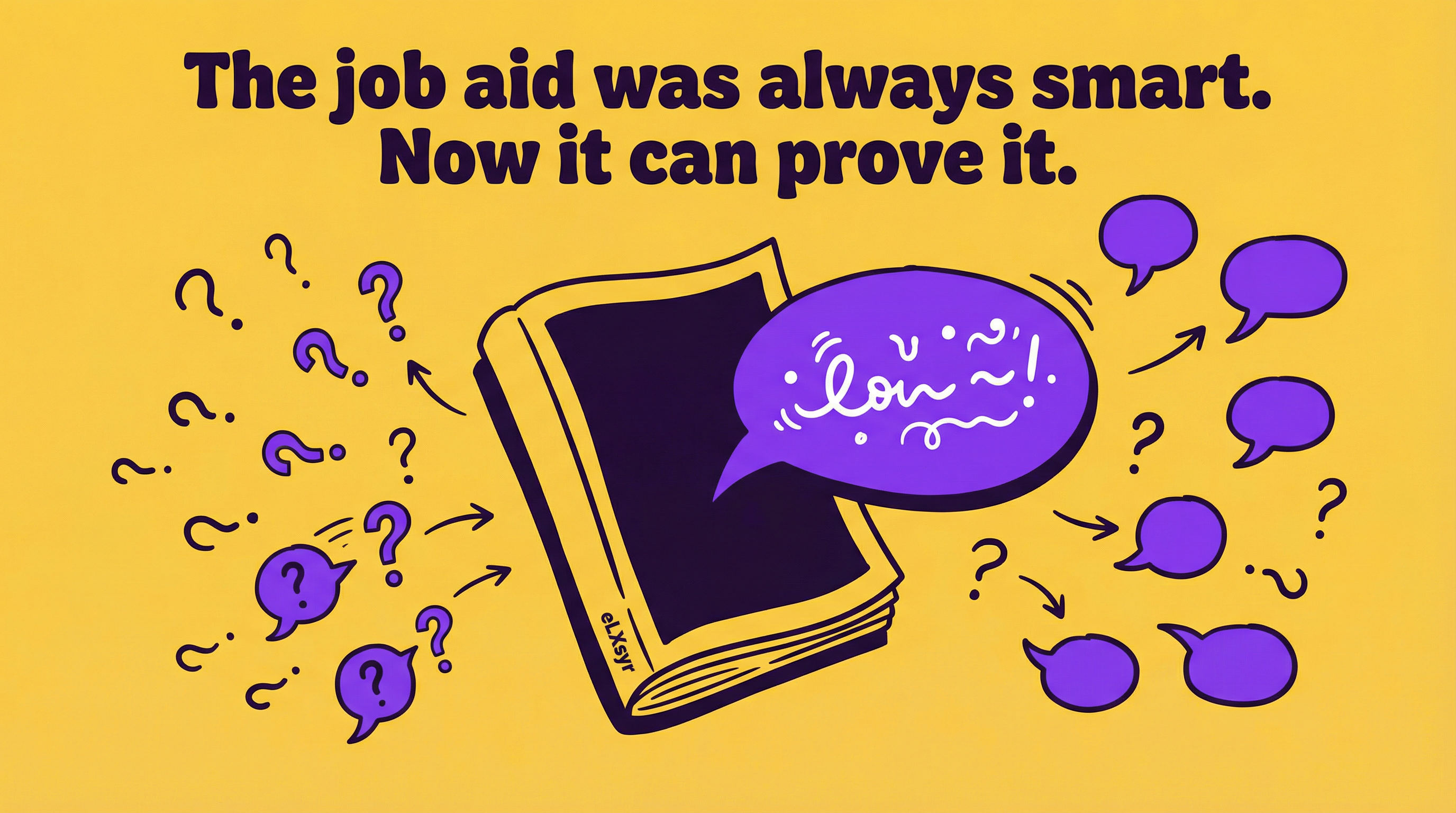
Learner support fixes this. It turns stuck moments into wins. But most courses miss it. Let's change that.
What This Means in Real Work
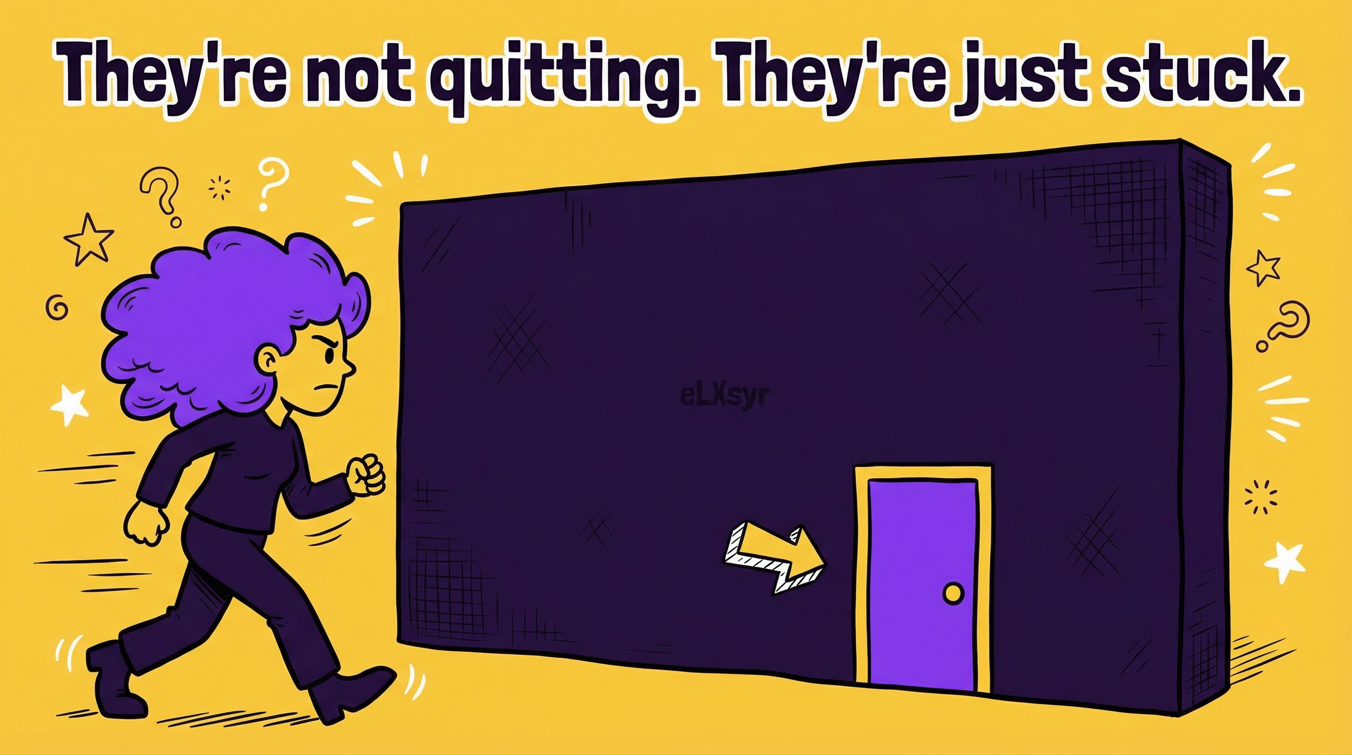
The "I'm stuck" moment is when confusion stops progress. Learners face unclear steps or tricky concepts. Without help, they bail.
Take a compliance course on data privacy. A screen explains encryption. But jargon trips them up. They drift off. Your training fails.
Good learner support spots these spots. It offers in-course help right there. No hunting forums or emails. This keeps flow smooth and reduces friction.
Practical Steps
Junior IDs, start here. These steps use tools you know. Build support that works.
- Map pain points first. Review your course flow. Ask: Where might they stall? Complex processes or new terms? List 3-5 spots.
- Add click-to-reveal help. Use expandable text or tabs. Hide tips behind clicks. Tools like Articulate Rise make this easy. Show just enough to unstick them.
- Build quick knowledge checks. Place short quizzes after key sections. Give instant feedback. Wrong answer? Link to a simple explainer. This guides without overwhelming.
- Include self-paced controls. Add pause, rewind, or progress bars. Let them control speed. Pair with tooltips for on-demand hints.
- Test with real users. Share a draft with 5 colleagues. Ask where they felt stuck. Tweak based on feedback. Iterate once more.
Common Mistakes
- Overloading screens with info. You cram everything. Learners drown. Stick to one idea per screen. Use bullets, not walls of text.
- Hiding help too deep. Bury tips in menus. No one finds them. Put in-course help where friction hits. Make it obvious.
- Ignoring mobile users. Desktop tests fine. Phones break it. Check taps and swipes. Ensure support scales.
- No feedback loops. You assume it works. Learners disagree. Skip user tests, and problems stay hidden.
Leader Lens
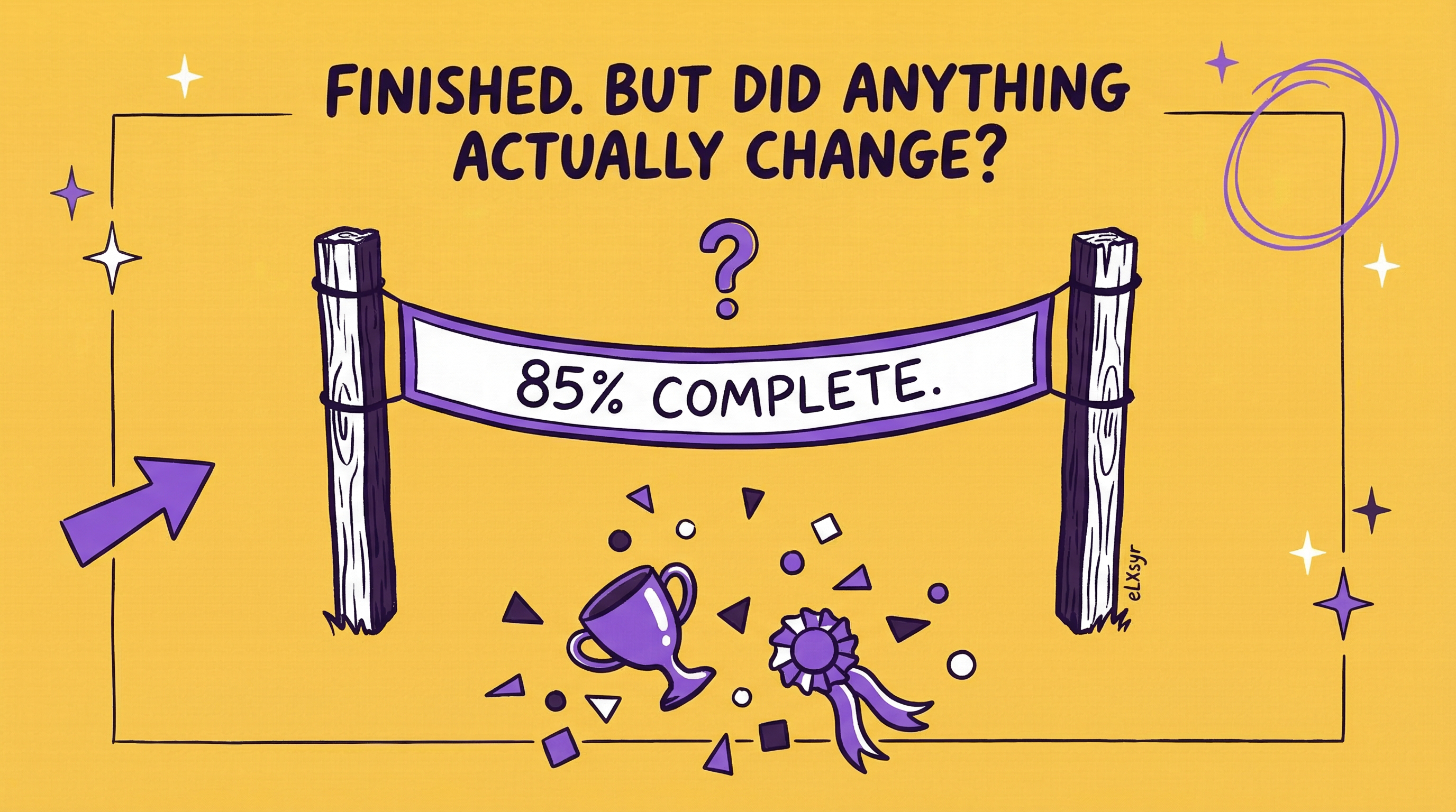
Seniors and L&D heads, focus on impact. Track completion rates before and after changes. Watch drop-off points in analytics. High quits signal weak spots.
Measure adoption via engagement time. More time spent means better support. Risk? Over-customization bloats budgets. Start small, scale what works.
Freelancer Lens
As a freelancer, smart learner support sets you apart. Clients see fewer complaints. You deliver faster with templates for common helps.
Reduce friction upfront. Less rework from bad feedback. Charge premium for courses that stick. Show completion data in proposals. Clients love proof.
Quick Checklist
- Identified 3-5 stick points?
- Added clickable hints or tabs?
- Included instant feedback quizzes?
- Tested pacing controls?
- Got feedback from 5 testers?
- Checked mobile view?
- Tracked drop-offs in pilot?
FAQ
What if my tool lacks built-in interactives?
Use free add-ons or simple hyperlinks to pop-ups. Keep it basic but helpful[1].
How much time does this add to design?
About 20% more upfront. Saves weeks in revisions later.
Does this work for short micro-courses?
Yes. Even 5-minute modules need one key help spot to reduce friction.